Overview
Background
Mudtown Farms is an urban farm in Los Angeles, CA. Located in a food desert, it's mission is to provide low-income residents with free organic fruits, vegetables and wellness workshops.
Problem
Mudtown Farms is publically funded & are required to meet specific goals. However, they struggle with low customer retention rates, community outreach and community involvement.
Audience
College students
Unemployed residents
Residents in 90002, 90059
Residents with chronic illnesses
Parents
Solution
The final outcome is a high-fidelity prototype that allows users to create an account, set up personalized results, claim a free produce bag per their availability, learn about wellness and sign up for workshops; which directly contribute to Mudtown Farms meeting their short-term goals.

Competitive Analysis
What kind of experience do users expect for this type of service? This was a critical question as it helped me ideate possible solutions on how people would learn to appreciate Mudtown Farms.

Research & Discovery
Through my research, I identified Mudtown's users’ frustrations and simultaneously identified the ways these issues could better be resolved.
I obtained a total of 22 surveyees and 12 made it through the screening process.
Demographics
Survey Results
“What would motivate you to attend a workshop or claim a free bag of food?”
If my friend was there
If there was an incentive
If I could book it from my phone
Pain Points
After interviewing 4 participants from surveys received — I was able to generalize a few pain points they all shared regarding the reasons why they don’t show up to Mudtown Farms for free food, or why they aren’t inclined to eat healthy.

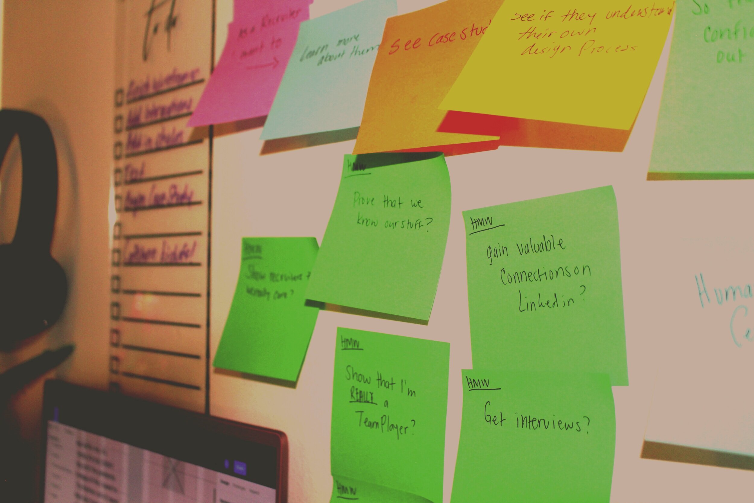
Process
Taking these insights, I empathized with the audience and ideated different designs that would help Mudtown Farms gain clientele.


Meet Krystal
Krystal is a 47 year old, single mom of 3 in the city of Los Angeles. She was recently diagnosed with (treatable) breast cancer and is extremely saddened and worried by the news.
She's motivated by the love of her children, she worries she will pass soon if she does not change her habits. In order for her to adapt to her cancer, she wants to learn the small things that will help her feel better. A few things she wants to do are changing her eating habits and moving her body to deal with stress and mental health.
Frustrations
Clean food is expensive
Is used to eating what she wants
Doesn’t know the benefits each food has on her body
If she feeds herself, she has to feed her entire family as well
Goals
Learn about what foods to avoid while she has cancer
Receive affordable produce
Take a class that helps her alleviate her stress.
Journey Map

User Flow & stories
As a Cancer patient, I want to learn about food so that I can heal my body from toxins and choose healthier options for my condition.
As a Cancer patient, I want to join a workshop so that I learn how to manage my stress.
As a low-income student, I want to pick up free produce based on my availability, so that I never miss out because of school.

Sketches

v1 + v2 of home page ideations
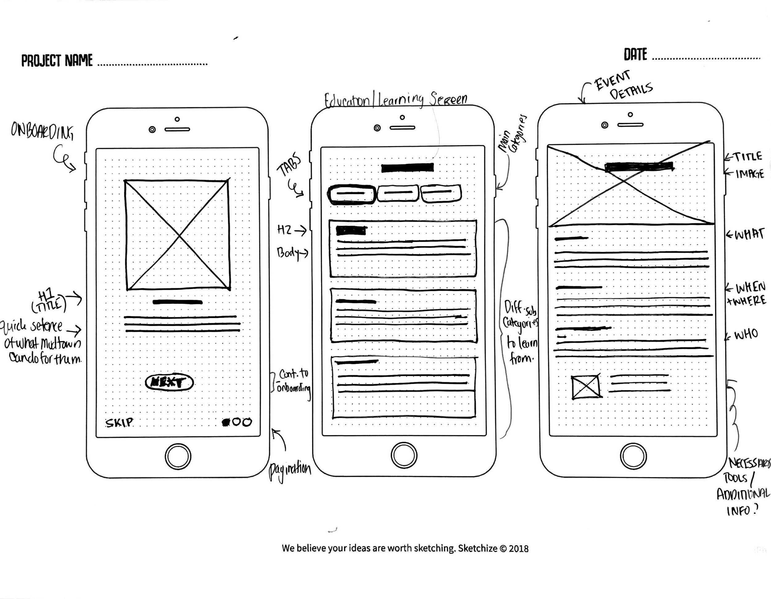
Overall sketching of onboarding screen, learning screen and event details.

Crazy 8 sketches
Wireframing

This page wasn’t as visually aesthetic as I assumed it to be. After critique sessions, I learned that I was lacking strong design principles. A few to mention that I was missing here are hierarchy, consistency and spacing.
Since I didn’t show consistency, I decided to remove the long curvature placeholder and establish stronger hierarchy through typography and displayed necessary information “above the fold”.
Usability
Usability testing done on Version 2.0 (via Useberry).
Key Finding: 90% of tasks were completed with a 100% success rate.

Task
Users were asked to create an account in order to explore the app.
100% of users followed the happy path
0% of users skipped the onboarding


Task
Users were asked to register for a Yoga workshop.
100% of users successfully completed this task.
80% of users took the optimal path to complete this task.


Additional Research
I moderated 4 additional testing sessions where users expressed to me how they felt throughout the process
All participants stated that the app is
easy to follow
easy to understand
One participant noticed a small inconsistency in the design that I was able to have revised afterwards.

The participant noticed an inconsistency in the size of the time slot buttons. Since I utilized Figma’s “Auto Layout” for this page, I hadn’t set the proper resizing properties. I was grateful for having that extra feedback and happy with the final result once I went back and set them all to be the same.
Key Takeaways
Separate myself from my design
Understanding how to follow research data to fulfill the user’s need is the primary goal. Remembering this allowed me to validate and reject my own assumptions and concepts. Without focusing on the user throughout the scope, it would have been easy for me to get lost in translation and add in features like “Rent the space” which is one of the businesses long term goals, but not an immediate need or focus for the product.
Next steps
Although most of users’ frustrations were deeply invoked in their living situation, I’m positive that Mudtown Farms can succeed and immediately impact it’s audience. In order to complete development for this mobile app, actionable tasks are:
Testing
Conduct guerilla usability testing within the community.
Marketing
Mudtown Farms needs to establish marketing practices in order to really get the community involved.
Writing
Consult a copywriter to assist with writing content for the “learning” category.
Developing
Consult a developer to finalize the last steps of this project.
Final Thoughts
Giving users the ability to learn and try new things is what Mudtown Farms wants to ignite within the community and I think this app really helps tie together their mission and they will find much success and positive outcomes in the community, when this product is developed.