Overview
Localeyez is a local activities/experiences start up. They wanted to transition to a mobile app that uses machine learning to change the UI on a weekly basis to accommodate their users’ preferences.
Audience
Age: 21 to 50 years old
Annual income: $30,000 to $120,0000
Location: Large Urban Areas, United States
Interests: Food Tours, Bar Crawls, Trivia Nights, Hiking, Festivals, Block Parties, Art Walks, Sports, Nightlife, Concerts, Board Games, Family Friendly, Bowling
Attitudes: Optimistic, Social, Seeks Spontaneity
Challenges: Social Isolation due to Urban Culture, Lack of Time and Organization for Family Outings, Friends are Picky
Solution
In the two weeks I was given to complete this project, I designed an interface that uses machine learning to personalize the user’s experiences. By following trends, design principles and branding elements, I designed a high fidelity prototype that kept user’s engaged and was aesthetically pleasing.
* The following artifacts were provided to me: Competitive Analysis, Persona, Sitemap, BrandingCompetitive Analysis
-
This is Airbnb's initiative to build connections between its visiting customers and locals. Users can choose categories, hosts, and locations to find something that interests them. Categories for experiences include animals, cooking, adventures, and more. Choosing a host allows users to select an experience by clicking on an image of a person and a description of the activity, such as "mole cooking class with an Indigenous cook." And users can search for locations to stay in either locally or around the world.
-
Foursquare is a location technology company that consists of two apps, Foursquare and Swarm. Their B2B offerings include Places (for developers), Pinpoint and Attribution (for marketers), and Place Insights (for analysts, based on the world's largest foot traffic panel).
-
Meetup is an online service used to create groups that host local in-person events. The company had more than 35 million users as of 2017. Customers can use Meetup for networking purposes, to make new friends, or to find an activity group.

Meet Heather
Name: Heather Stevens
Age: 36
Work: Pre-K Teacher
Family: Married, 2 Kids
Rochester, NY
Heather is a pre-k teacher who works 5 days a week. When she is not at work, she is managing her hectic life as a mother & wife. It is important for Heather to be able to spend as much time with her family as possible. She generally reads this paper because of the local events to bring her children to on the weekends. Heather is looking for something that is quick and easy to read to manage her schedule.
Wish List
Easy navigation
Fast responses
Easy readability
Quick loading
Current events
Local events
High quality images
Goals
"I am looking for a website that will have local events for me to bring my children to on the weekends, that is also easy & quick to navigate with my hectic life as a mother."
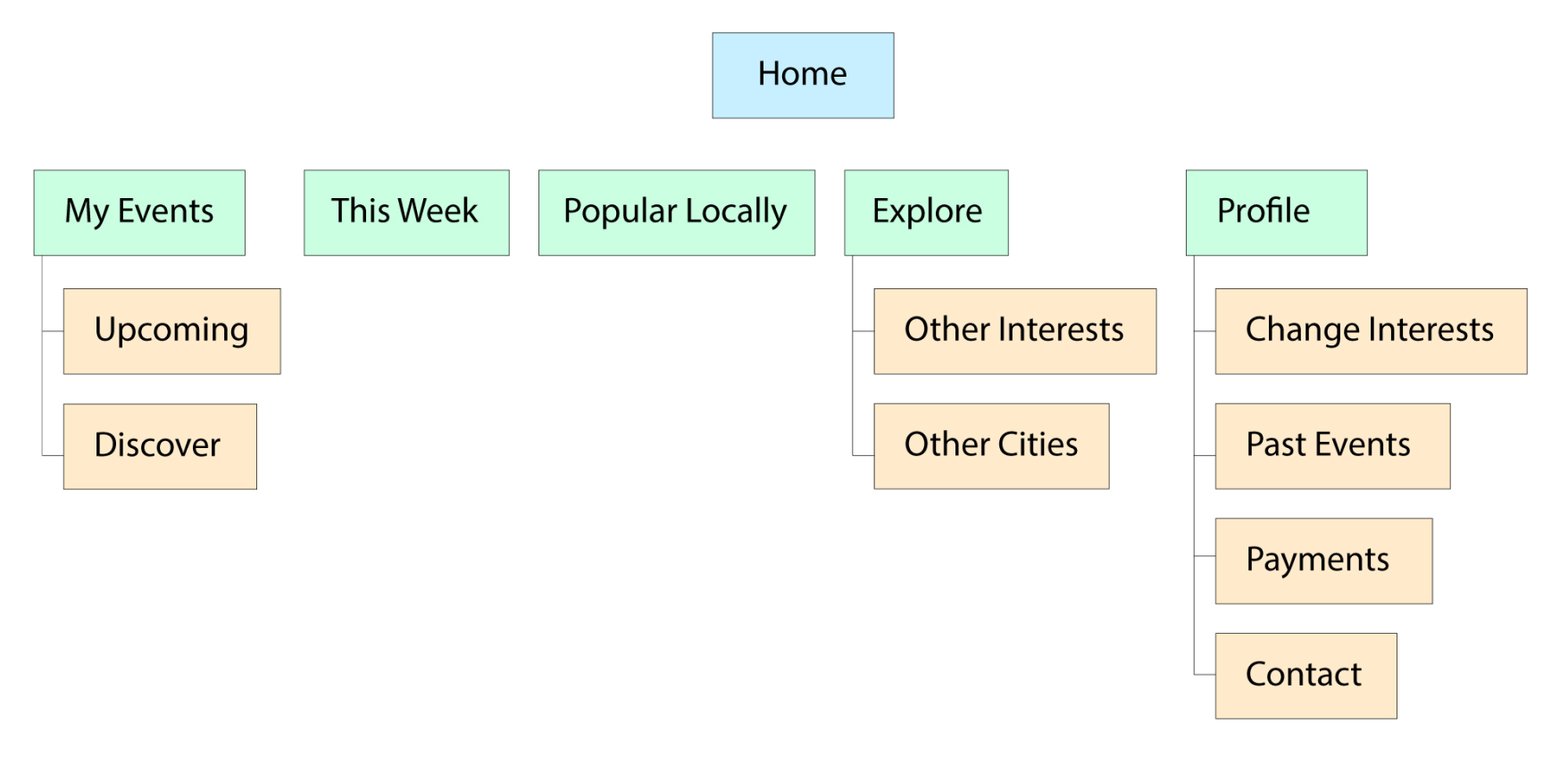
Sitemap
Branding
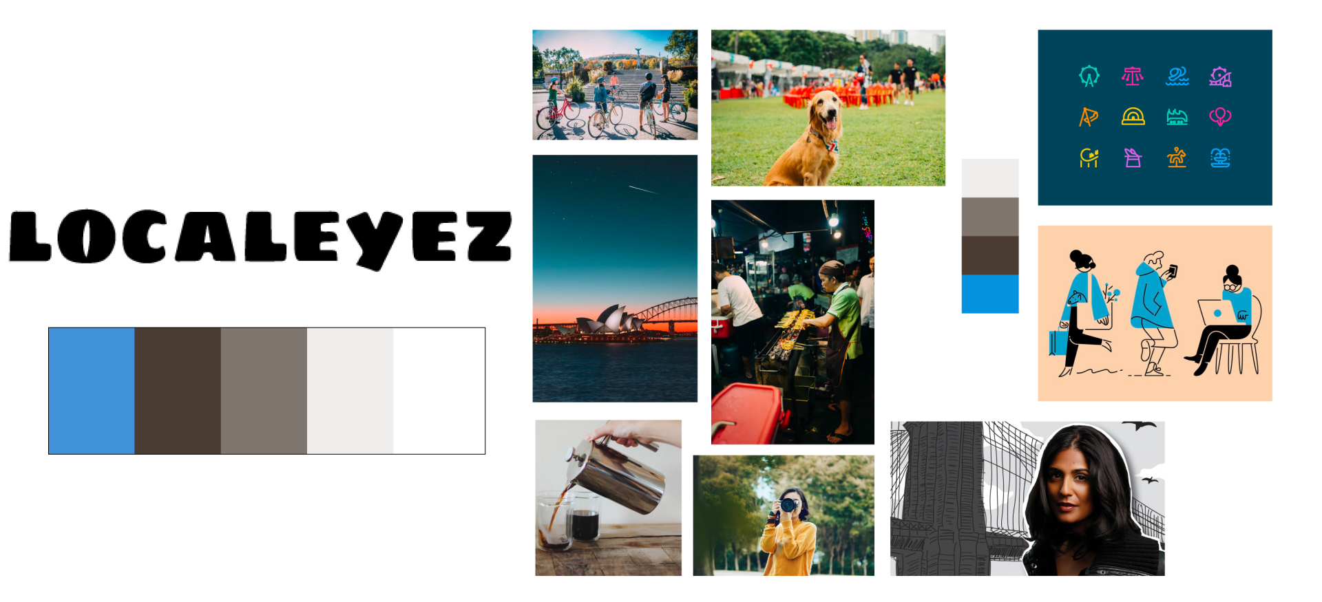
This is the original color palette, logo & moodboard I received. I was given the opportunity to change the logo & colors for this project.
Using the same moodboard, I created this color palette that is brighter and fulfills the feeling of fun that Localeyez focuses on. When looking at the logo, I knew it had to change—the logo I created promotes friendliness through the cursive type and the bright blue I used promotes feelings of high energy, exhilaration and high spirits.
Sketches
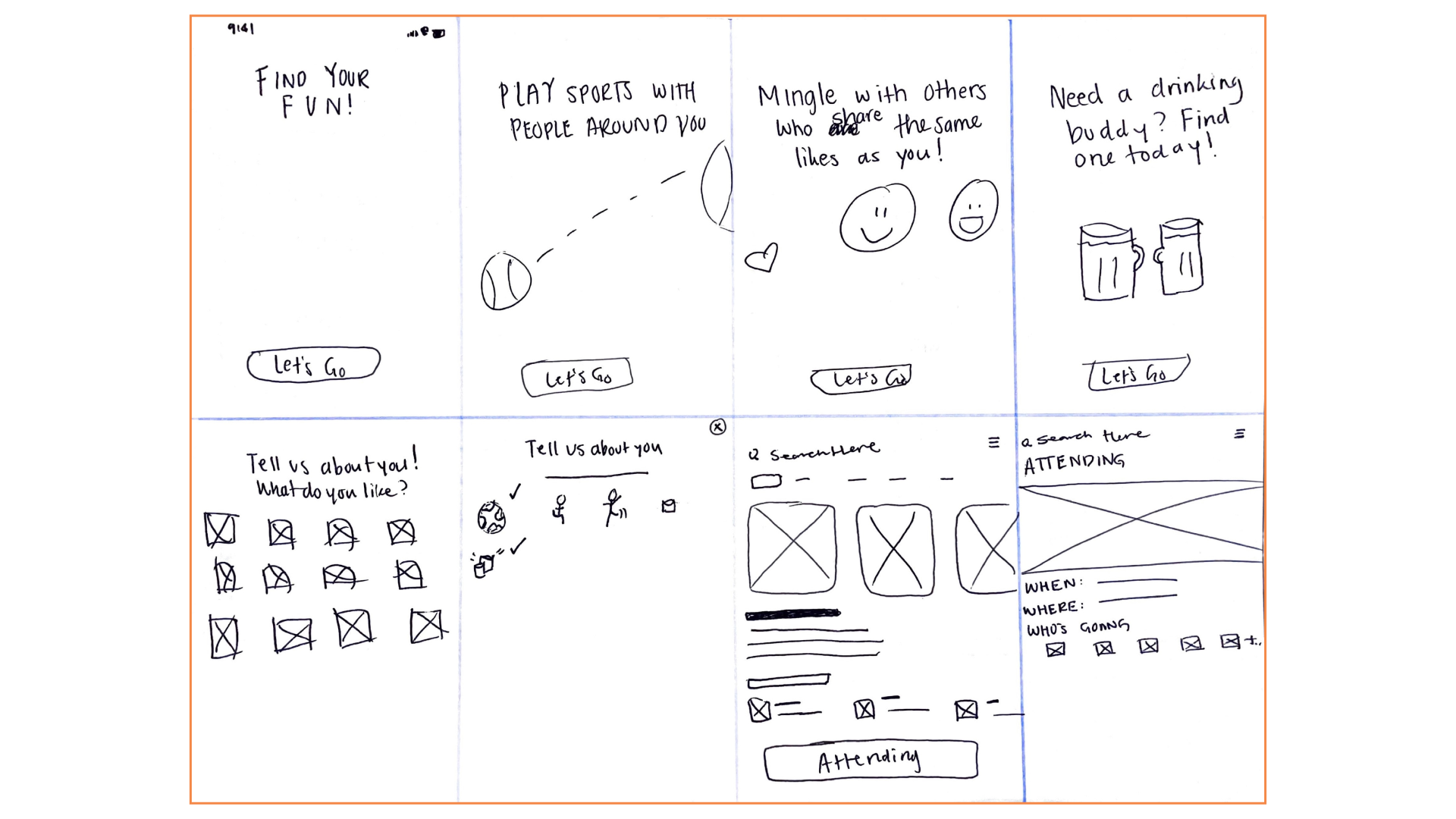
Crazy 8 Sketches: Onboarding & Home screen ideations
Signup & Preferences screen sketches
Wireframing
Since I received wireframes for the existing site, I recognized important categories that would be included for mobile. These categories are “My events”, “This Week” and “Popular Locally”.
Other screens I designed from this are a user profile with access to edit their information and preferences.
Wireframing
Ideations: Localeyez promotes fun, so it was important to reflect that through the design. Since machine learning requires user input to provide a personalized experience, I spent a lot of time on this preferences screen. Here we’ll see the many categories of events a user can experience.
Key Takeaways
In V1 I created two frames to show an interaction so users would receive feedback on what they just selected. I wanted to use images that related to the activity but after considering readability, I noted that this could use improvement. During a design critique, my team was able to help me ideate a better solution for this screen and it led me to V2.
When I worked on V2, I joined Figma’s interactive components beta and learned quickly how to create consistent variant states. I condensed two frames into one and was able to give users clear feedback of their selections.
Wireframing
Ideations: Considering the time constraints and scope of this project, a few of my original ideas for a home screen had to be refocused.
Key Takeaways
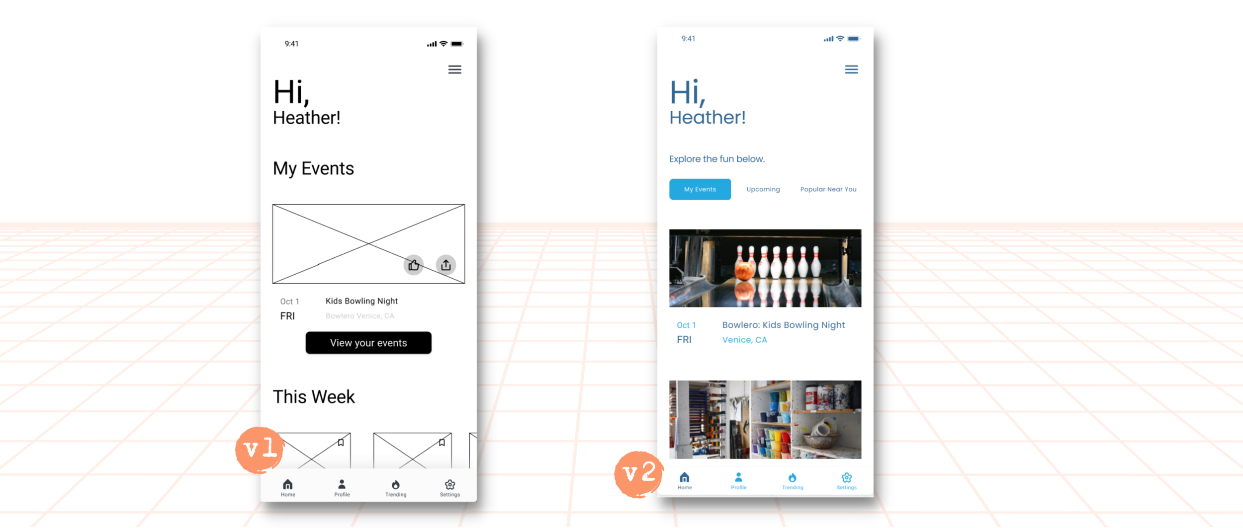
In V1 I created a wireframe that showed users their upcoming events, then “weekly” events using a horizontal scroll and under that, “events near you”. Somethings I refocused on: scope didn’t include a like, save or share feature, so in V2 we see a wireframe without these things.
Considering mental models, it is more intuitive to scroll vertically opposed to having to scroll vertically and horizontally, especially when things are related. In V2, I created a wireframe that changed the layout of events and instead of breaking off every category into one single screen, I added tabs so that events would be categorized better and easier to find.
Usability Testing
Usability testing done on Version 2.0 (via Maze).
Task
Open Question
“Tell us if you love it, hate it, feel confused, excited, etc-this is a safe space!”
"Using apps like this is not generally my interest, but the idea was solid. Some UI points of note: The white modal boxes on the the whit background was a bit bland. Maybe the yellow of the stars or the main blue as the background would make it pop out more.”
Tester #16431696 | October 23rd 2021, 5:40:32 pm
"Easy to use!"
Tester #52076746 | October 21st 2021, 9:21:37 am
"looks awesome"
Tester #48314933 | October 20th 2021, 3:26:08 am
"great job ! such cute animations really enjoyed that.
Tester #46712004 | October 19th 2021, 2:52:53 pm
Task
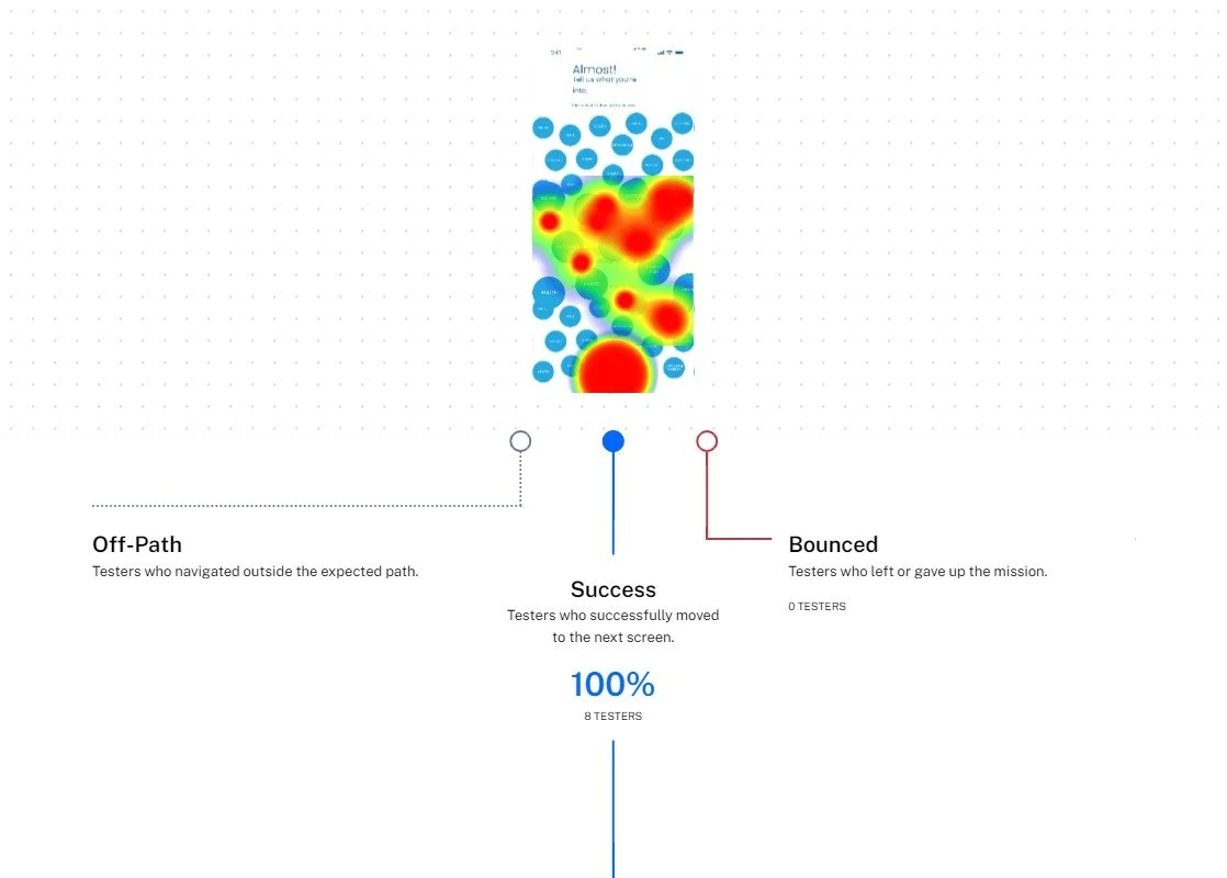
Users were asked to select their interests so the app can recommend events.
100% of testers completed this mission via the expected path.
Task
Users were asked if they enjoy the aesthetic/ design of the app
100% voted Yes on the opinion scale
What I learned
After reading the quotes from testers, it was evident that even when most people like a product, there is always room for improvement. These recommendations are taken into consideration and will be implemented in the future.
Upon further reflection…
the sizing of the text in this design was pretty small and is an important attribution to the success of the app.
A hamburger menu was unnecessary for this design since I have a navigation bar. This was redundant on my part, but it’s part of learning. I now know that there’s no need for both.
Final Thoughts
Working on this project on a 2-week time constraint while balancing other projects was very challenging. It was important for me to stay within scope so that I can manage my time better. I became appreciative of Clickup for helping me stay on track with the entire process.
Through this project, I practiced prototyping interactions, created interactive components for the first time and adapted to designing with pre-existing artifacts which required a lot of studying before beginning my own process.
