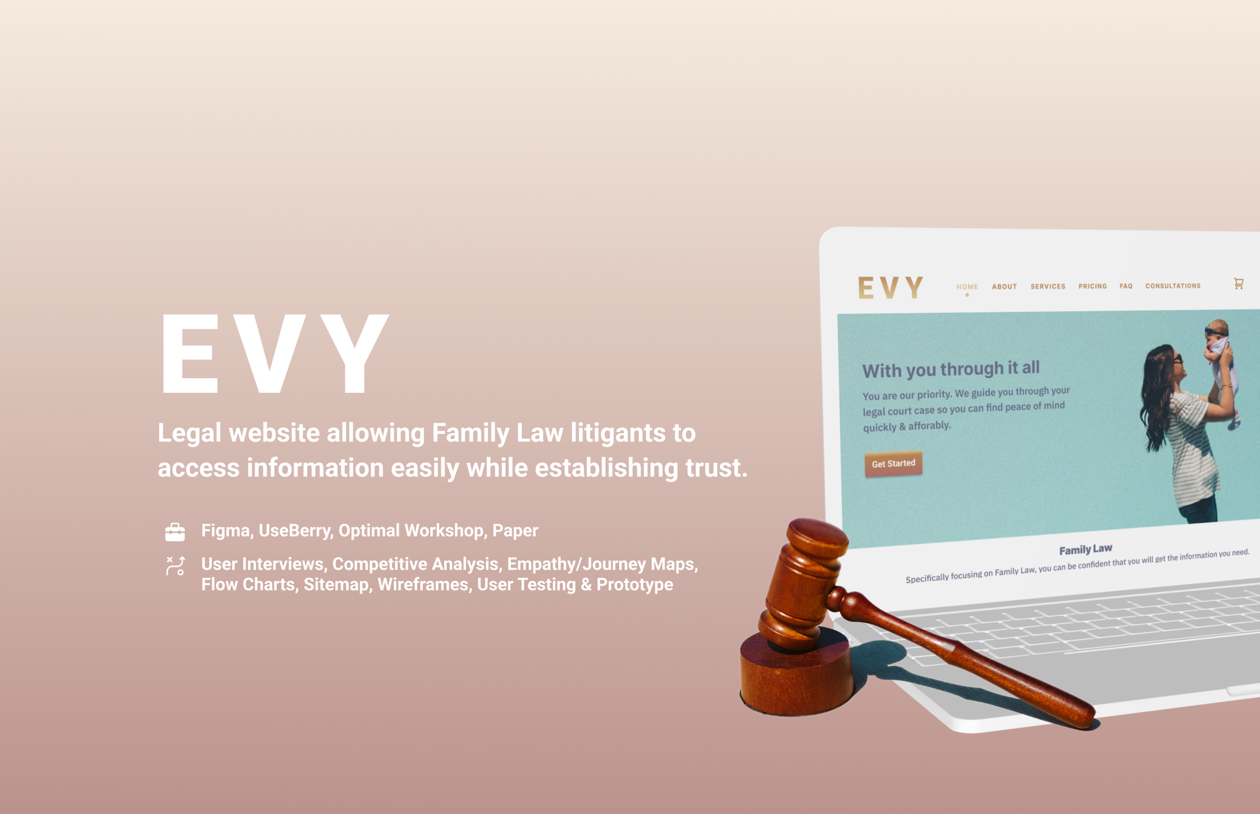
Background
Evelin Garduno from Los Angeles, CA was a paralegal for 7 years with the LA County Court and recently began her own practice as a legal document assistant. She helps her clients with documentation, offers legal information and identifies their goals so they can work together to reach them without having to bring in an actual lawyer., as that can be expensive for her audience.
The Problem
When users have a Family Law matter at hand, the ideal situation is that they Google a few general questions and potentially seek further help from a certified expert. The problem here was that EVY had a low customer retention rate that stemmed from this misconception that legal assistance is full of scammers, can be expensive and hide information on websites for the purpose of their users paying them for minimal interaction and sneaking in hidden fees.. Per my findings, I identified that many users don't trust many forms of legal assistance unless they have personally been referred to by someone close to them.
Audience
Couples with children
Couples facing domestic violence
Married couples seeking divorce
Parents seeking custody

Solution
The main priority when finding a solution was to pinpoint where the users' frustrations really were. My contributions to this include but aren’t limited to: conducting surveys, interviews, creating personas, mapping their flow, wireframing and prototyping during a Design Sprint.
My contributions helped me identify that users weren't trusting easily during their decision process regarding legal help because they weren’t finding answers quickly, prices were very steep (unclear in some cases) and the websites' feel seemed very impersonal and gave them the lasting impression that there's no human face behind their screens.
I took my findings and created a wireframe that would tackle users' insecurities and instill trust and credibility, all while being personable and relatable. Finally, I created a high-fidelity prototype and conducted usability testing until we were able to determine that the overall evaluation was successful!
Research & Discovery
Through my research, I identified Evy’s users’ frustrations and simultaneously identified the ways these issues could better be resolved. I obtained a total of 27 surveyees and 21 made it through the screening process. I took my findings from my survey and interviews and grouped them into pain points.
Demographics
Survey Results
What do users associate “trust” with?
Reviews and testimonials that match (On site + Yelp/Google)
Personal recommendations
Prices being stated clearly
Genuine empathy for users’ cases
Images of real people
Information of services being provided
Pain Points
“No transparency on prices which can open room for hidden fees.”
“Not enough information on how they tackle certain matters”
“Not having enough contact information/options to contact them first.”
Process
Taking these insights, I was able to fully relate to users’ frustrations when seeking legal help and trying to choose the best suitor for them. Through many meetings with my client, we sought out the best options on which additional features her users’ preferred based on the surveys and interviews.

Landing page with personal imagery, illustrations, testimonials and transparency in what is being offered.
Competitive Analysis
What kind of experience do users expect? This question led me to turn to the market; specifically to analyze their features and come up with a solution that would exceed Evy’s users’ expectations!
Feinberg & Waller
A very suitable competitor through a vast amount of information readily available to their users and access to most of the features Evy was considering. Their website puts legalities first and feels professional upfront, which may work for them, but Evy wanted to show friendliness first above all else, so I was tasked with taking these features and painting them in a new light.


Meet Adam
Adam is a 33 year old Hispanic male going through a pretty rough break up. His ex-girlfriend is filing for full custody of their 3 year old son, Jacob. He loves his son and will do anything to fight against her on this, so he needs legal assistance.
Adam is motivated by love & pain, he is a hero archetype. In order for him to win this battle, he wants to find a legal website that will answer his general questions quickly, and potentially schedule a consultation if the prices are stated clearly and are affordable. Primarily, he needs to feel that trust element throughout his journey.
Frustrations
Expensive
No valuable information regarding his case online
No good recommendations from his peers
Time
Doesn’t want to lose his son
Goals
Connect with someone who supports him fully, is transparent & empathetic with him
Connect with someone who will ease his frustrations
Find a credible and affordable paralegal
Empathy Map
Adam’s frustrations and goals are directly influenced by his thoughts, peers and his immediate environment. By creating this empathy map, I was able to put myself in his shoes and really see the situation clearly.
This empathy map goes into detail about everything he hears, thinks, feels, sees, says and does. He feels scared because paying for this type of legal help can be very expensive. He feels alone because nobody is understanding or relating to him. My goal here, is to help Adam & others just like him, feel safe and supported.

Click for Figma file
Journey Map
It’s important to track Adam’s potential journey as he looks for the right person to help with his legal case. By creating a journey map, we are able to see all the motions he may experience; this will ultimately help in identifying the pain points throughout this process.

Click for Figma file
User Flow & stories
As a litigant, I want to see prices, so I am motivated to consult.
As a litigant, I want to schedule a consultation, so I can learn my next steps.
As a litigant, I want to find answers quickly, so I can understand my case quicker.

Click for Figma file
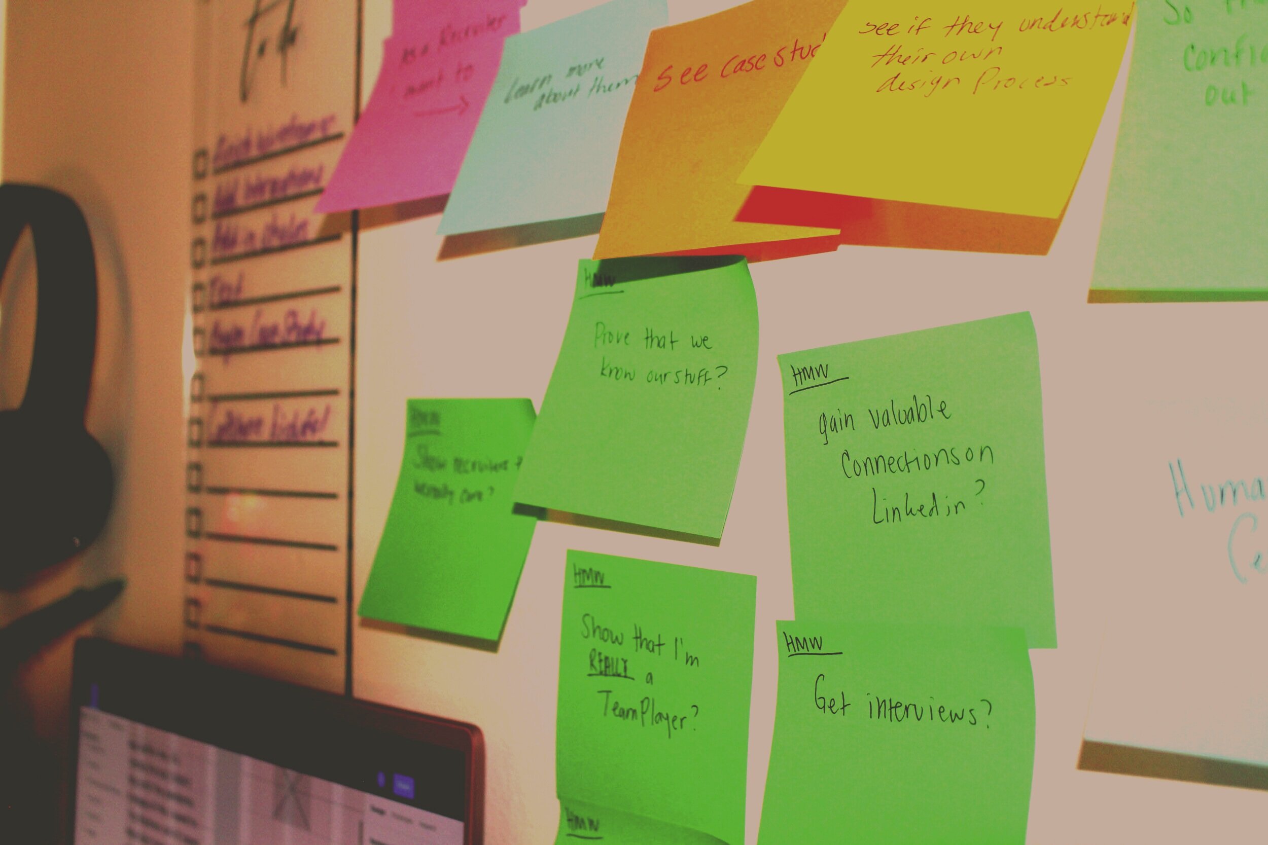
Sketches
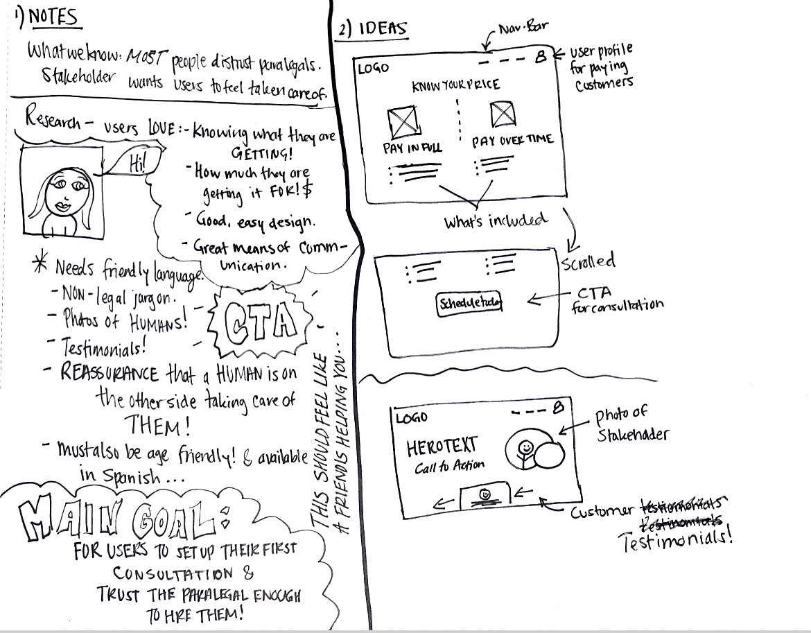
Design Sprint: Solution Sketch
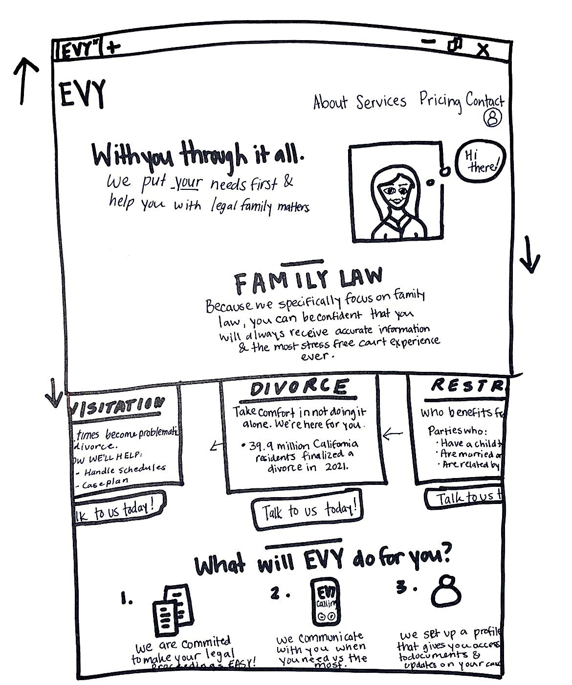
Landing page sketch
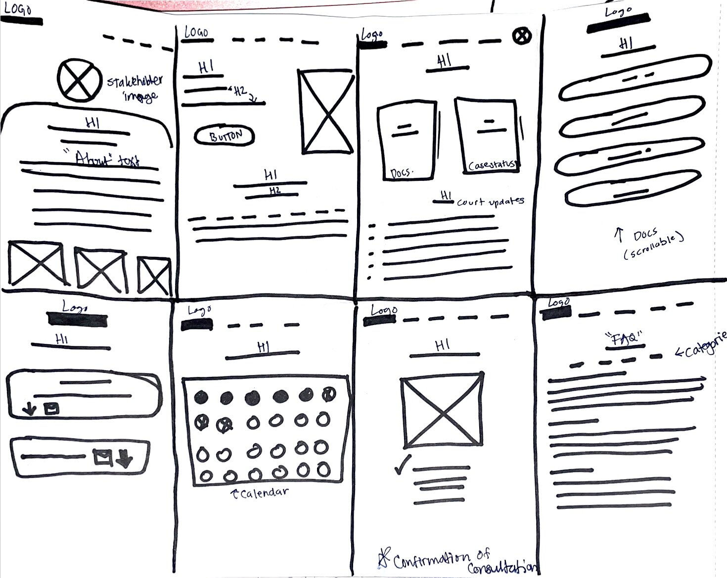
Crazy 8 sketches

Storyboard sketch

"About" Paper Prototype

"Services" Paper Prototype

"Landing" Paper Prototype (Portion)
Paper Prototyping
Ideations: Upon analyzing the usability of my paper prototype, I determined the flow of it was easy to understand and my testers were able to successfully get a feel of what the site would be providing them and what each button would take them to.
Changes I made:
The “Services” were originally included on the landing page and after receiving feedback from many, I understood that too much information in one place can also be overwhelming for users. So I moved this information to the Services page and after getting a developers perspective, I opted to use cards instead. You can see the final result of this ideation below.

Wireframing
Ideations: Through critique sessions with my cohort and mentor, I applied valuable feedback and turned my ideas into fully functioning wireframes. As an example, let’s take a look at the Services Page.

Key Takeaways
V1: This page wasn’t as interactive as I planned for. I was grateful to have received a developers perspective and to have learned that this carousel might contribute to slow loading times. Since I wanted to reflect trust and credibility, I analyzed websites like Capital One and identified their patterns, some of which were Tabs and Cards.
In V2 I gathered the information into cards but based on usability results, this didn’t provide sufficient information regarding services to users. So instead of using cards, I opted for tabs (V3). The process seen through these ideations, transforms the carousel into tabs in V3.
Secondly, I learned that users prefer their information upfront and in the same page, so I changed the content to reflect this need. Instead of making them click on a “Learn more” button, I added all the information needed under the tab.
Version 3 works more efficiently since there is no need for extra navigation and all relevant information is in the same place.
Usability
Usability testing done on Version 2.0 (via Useberry).
Key Finding: 90% of tasks were completed with a 100% success rate.

Task
Users were asked to click on any information that they would relate “trust” with
50% of users navigate directly to the about page on first click
12.5% of users navigate directly to the prices page
12.5% of users navigate directly to the services page
12.5% of users navigate directly to the FAQ page

User flow (Via Useberry)

Hotspot (Via Useberry)
Task
Users were asked to access their dashboard.
I received a 71% success rate for this task. Even though the misclicks showed us that the design for this screen was intuitive, the heatmap shows that the prototype should’ve had more clickable elements throughout. Many users wanted to explore the rest of our prototype and fill out forms which directly contributed to the misclick rate, which was 63%.

User flow (Via Useberry)
Hotspot (Via Useberry)
Task
Users were tasked to schedule a consultation and pay for it.
This task provided the best insights as the misclick rate was 55% and the success rate was 83%. After analyzing the results for this, I decided this page definitely needed change, so I implemented ways to make this task easier for users in Version 3.
User flow (Via Useberry)

Hotspot (Via Useberry)
What I learned
Testing can be very insightful for a designer—it helped me separate the design from myself and ultimately gave me the opportunity to accept that original concepts may not always be as good as I expect them to. There were a lot of elements and components I created that weren’t fulfilling their purpose and thanks to testing, I was able to identify these weaknesses and make them better.
Next steps
In further developing this product for Evy, actionable tasks are:
Testing
Conduct more usability testing
Personifying
Acquire high definition head and action shots of Evy to personify the site more
Writing
Consult a copywriter to assist Evy with content as she provides a lot of valuable and heavy information
Developing
Consult a developer to finalize the last steps of this project.
Final Thoughts
Being a part of a design sprint was very confusing as a new designer. I was grateful to have had a great support system while undergoing this. I learned a lot from the process; It’s important to learn how to keep pushing and drop the ideations where the deadline is—being a perfectionist can be a flaw here. Overall, I enjoyed conducting interviews with some of Evy’s former clients as they taught me a lot about their journey to finding her. Evelin and I worked great together and my research was very useful to her as well. She is planning on launching the final product and we are both very excited to see it live soon!